• HOME
  • MEET NICOLE
  • DESIGN WORK
  • HOME
  • MEET NICOLE
  • DESIGN WORK

**VIDEO+GIVEAWAY** Your Are The Best! w/ Ellen Hutson November Release

November 13, 2017

Happy Monday!

I am so excited to share today’s project with you all because I am hanging out with one of the coolestΒ company in this industry, Ellen Hutson! Ellen and her team are so genuine and kind, it always makes me feel so blessed to know them as friends. When they asked me to guest design for them, I was over the moon!

I am hijacking Hello Monday video today as Jullie is away – So make sure to head over to Ellen Hutson’s blog, The Classroom to see a full video tutorial and supplies list. You can also find the list below.

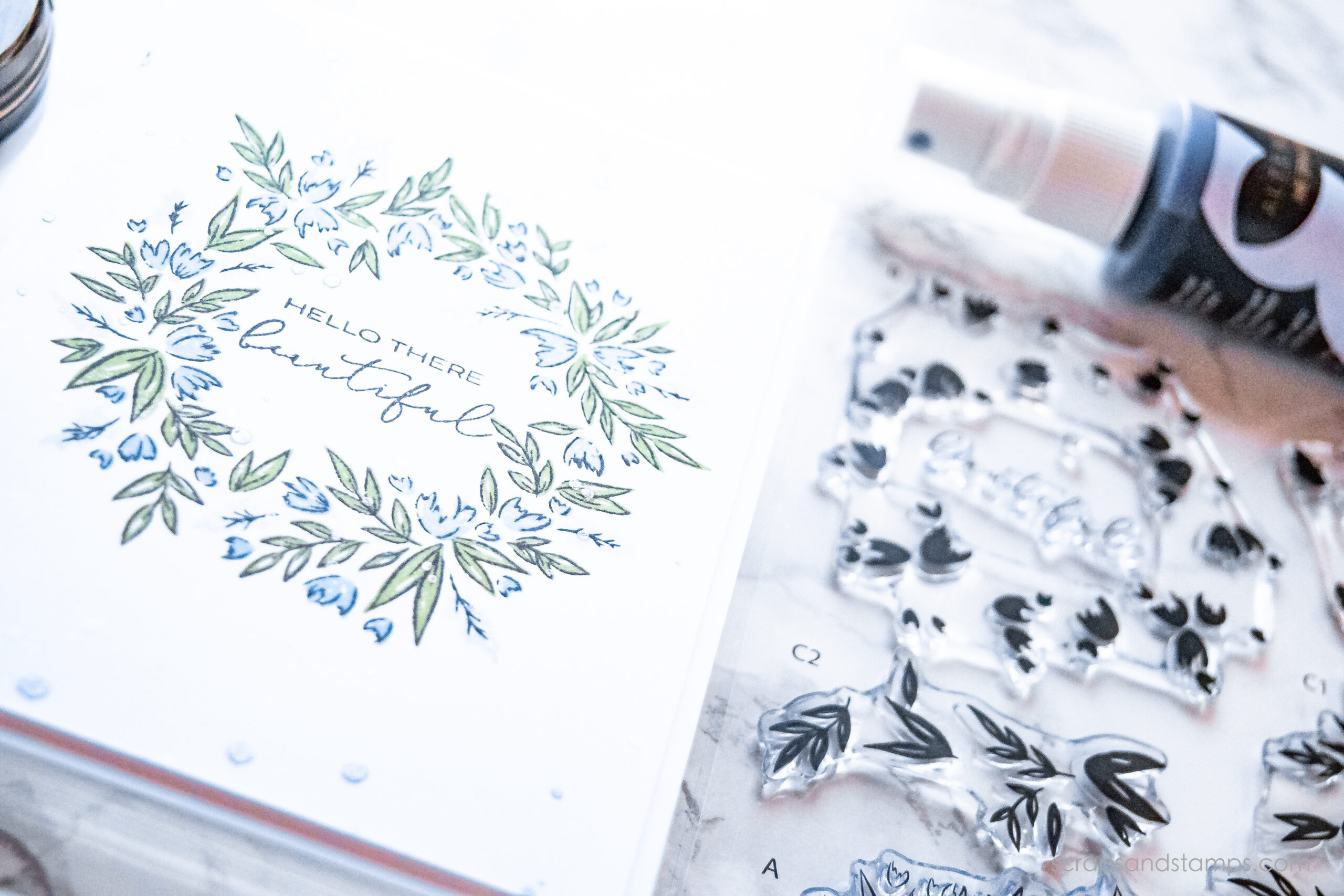
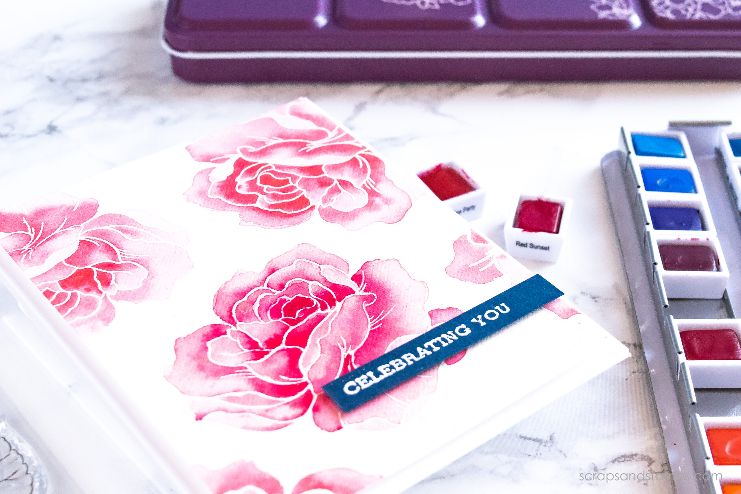
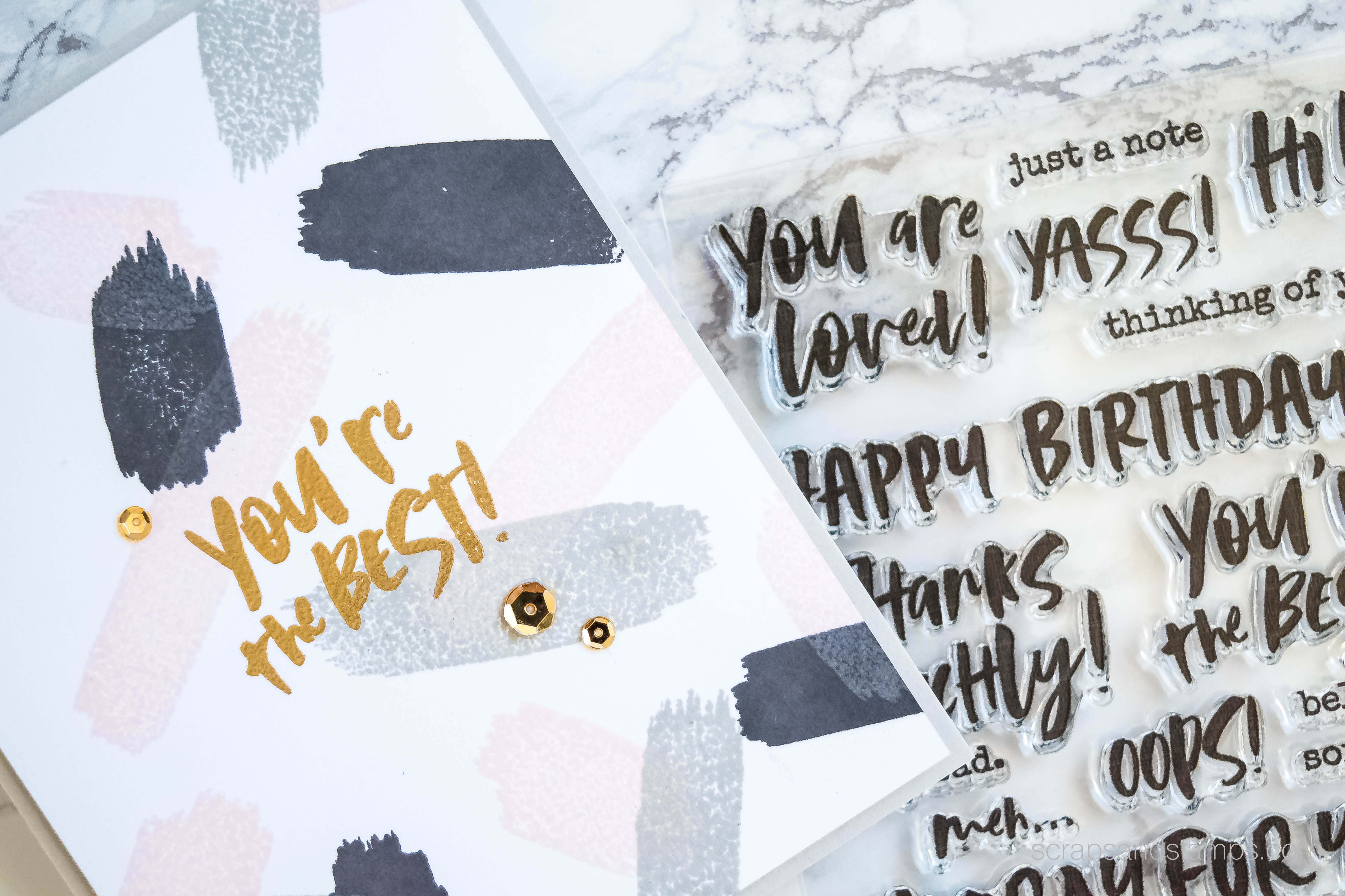
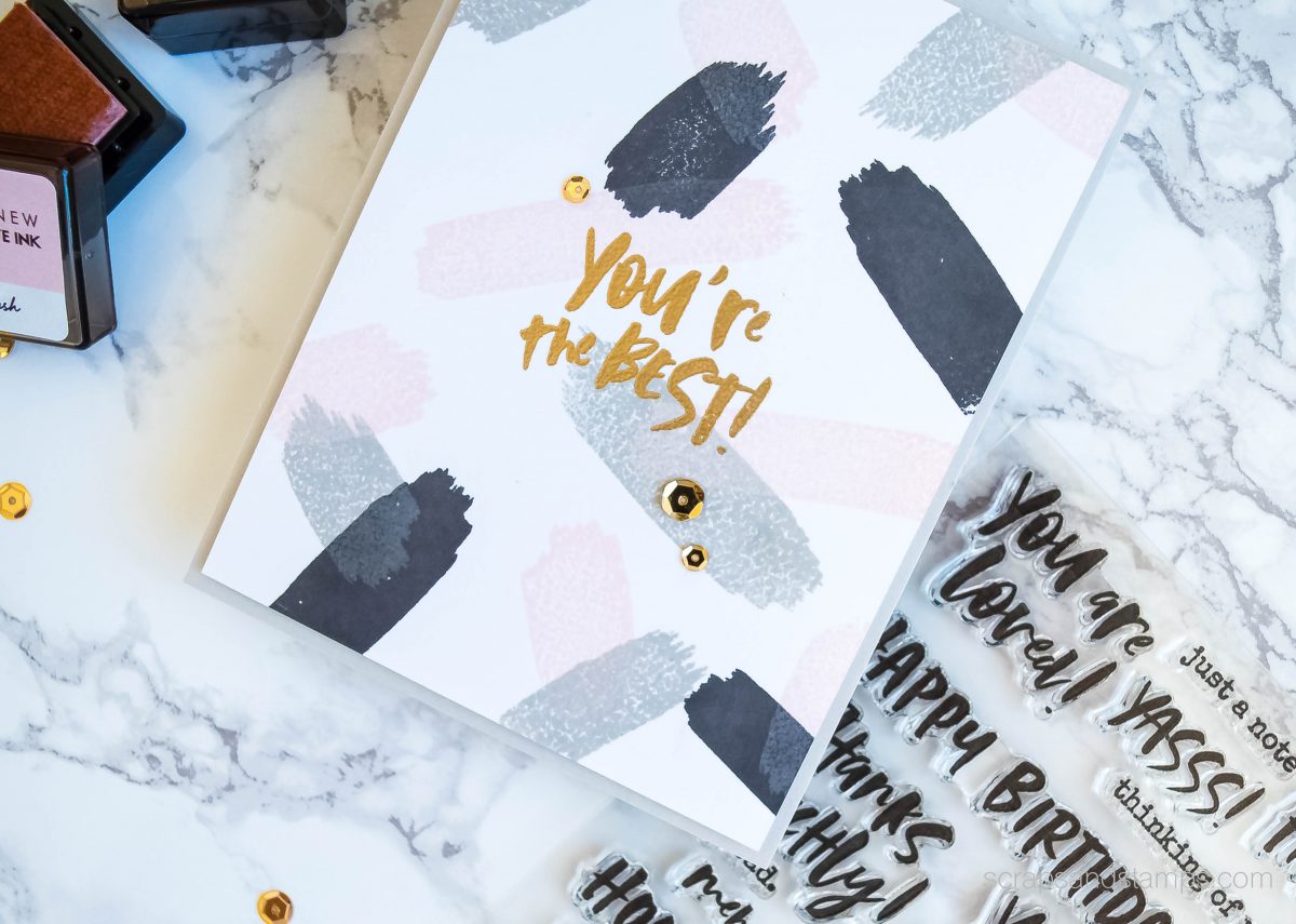
In today’s project, I will be sharing an easy way to create your own background for a simple yet elegant card. And I am also sharing my new favorite color combination for the fall/winter season!
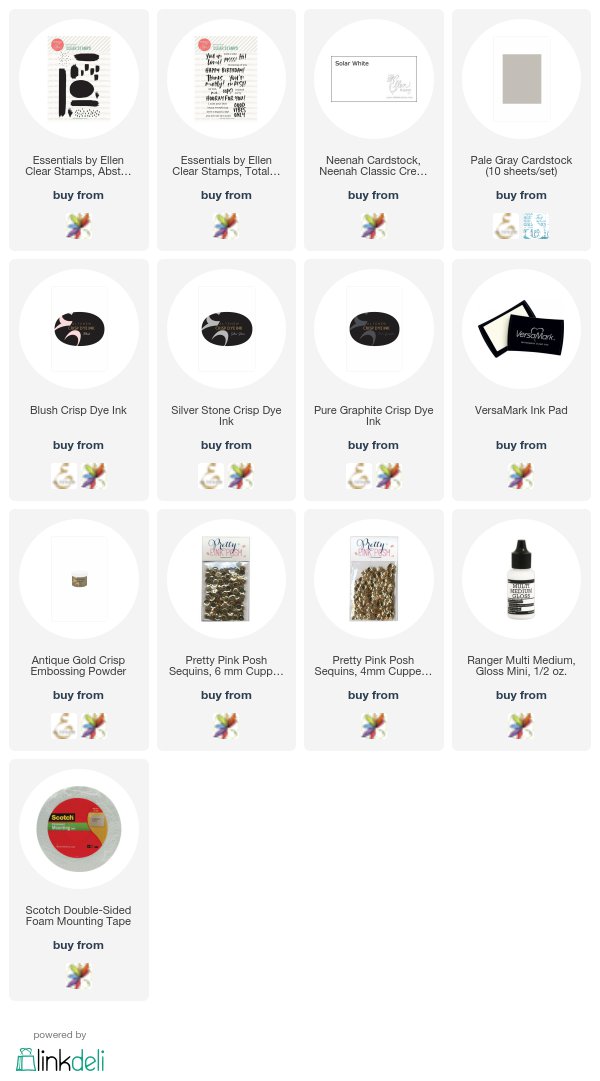

SUPPLIES

See below for all the products used in today’s project. Click ATN for Altenew, EH for Ellen Hutson, SSS for Simon Says Stamp, orΒ AMZ for Amazon. I participate in several affiliate programs where I get a small commission at no additional cost to you when products are purchased through links I share here. Thank you for your support!


GIVEAWAYS

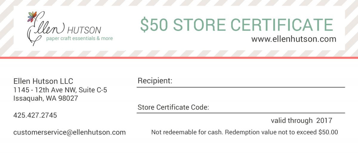
How about a shopping spree? I am giving away a $50 (yup, $50!) gift certificate to Ellen Hutson’s online store to a lucky winner!

Leave me a comment below and share your favorite color combination for fall/winter season. Giveaway closes on November 19th, Saturday at 11:59pm PST. I will announce the lucky winner here on the 20th.

Thank you for stopping by!

WINNER

Congrats, Marianne! You are the lucky winner of the giveaway! Please send me an email at nicole@scrapsandstamps.com to claim your prize!

VIDEO
Share

ALTENEW  / ELLEN HUTSON  / VIDEO TUTORIAL

Nicole
Cardmaker, stamper, watercolor enthusiast, and planner lover

You might also like

Stamping Tutorial – Step-by-step Stamp Layering (VIDEO+GIVEAWAY)
May 12, 2020
Simple & Easy Watercoloring on Stamped Images (VIDEO+GIVEAWAY)
April 17, 2020
Creating Watercolor Swatch + Gradient Watercoloring (VIDEO & GIVEAWAY)
April 2, 2020

56 Comments


Cindy
November 13, 2017 at 6:24 am
Reply

Great card and color combination! I agree with your thoughts on this great company and that’s how I came to your site. My favorite color combination for winter is kraft, red and white -when making cards especially. Thanks for the inspiration to try a different palette!


Kathy B.
November 13, 2017 at 6:38 am
Reply

Love word cards using unusual backgrounds. Could use card for men/boys.


Jackie Parkins
November 13, 2017 at 7:04 am
Reply

That background is so cool, I love your color combination. My favorite color combos are pretty traditional. For autumn I like to use reds and golds and for winter, either shades of blue and silver or the usual red and green.


Joan Bardee
November 13, 2017 at 7:25 am
Reply

fantastic card, love that color combo. Now i’m off to watch the video!


Sophie F
November 13, 2017 at 9:34 am
Reply

Hi Nicole!! I’m so glad that Ellen’s blog brought me to your blog. I can wait to look through all of your fun creations! I really love this card. The bright paint strokes against the white background is so fun and goes along with the sentiment so well! My favorite color combination for this winter season so far are some non-traditional holiday colors! I love dark burgundy, teal, and pink! I think this is a fun combination for winter but also reminiscent for the Holidays as well. Thank you so much for sharing! πŸ™‚


Dee Johnson
November 13, 2017 at 12:21 pm
Reply

Very lovely! My favorite color combo for fall/winter is silver and white.


Evelyn Burton
November 13, 2017 at 2:22 pm
Reply

My favorite fall colors are a combination of gold, burgundy, olive green, browns and oranges. I can always make something with these colors. For later I like red and gold, especially with some sparkle and also blue and silver.


Pai
November 13, 2017 at 2:59 pm
Reply

so simple, so trendy. love your color choices!


Gwen
November 13, 2017 at 5:44 pm
Reply

Your card is so perfect CAS! I love the color combo. I like rust, yellow, green for fall and blue or red with silver or gold for winter cards.


Patti J.
November 13, 2017 at 5:56 pm
Reply

Love your color combination, Nicole…what a great card! Congratulations on your guest spot! My favorite winter colors are burgundy and gold. Thanks for the chance to win such a generous prize!


SmilynStef
November 13, 2017 at 6:46 pm
Reply

I like rust, teal and golden yellow.


Lynn Griffin
November 13, 2017 at 8:12 pm
Reply

Very nice card. I’m pretty traditional with reds,a little green and anything that sparkles!!


Sally K
November 13, 2017 at 9:08 pm
Reply

Love your style and great tips. So simple but elegant.


Linda Carson
November 13, 2017 at 10:39 pm
Reply

Love the abstract background! It’s very classy and especially the colors you used! Don’t know if I have a favorite color combo but they do need to be bold colors! Thanks for your fabulous inspiration!


Anita in France
November 14, 2017 at 12:30 am
Reply

Cool, graphic and so stylish, Nicole … the colour combination is just gorgeous! My favourite colours for winter are aqua/blue/silver … they are so deliciously frosty … though I’ll be trying this one too for a fresh new look! Anita πŸ™‚


Rosali
November 14, 2017 at 1:46 am
Reply

Such a beautiful card! The embossing gives it just the right amount of elegance! πŸ™‚
My fave color combo is light blue/aqua and white with a pop of red!


Gabriella B
November 14, 2017 at 2:23 am
Reply

A very sassy card, love it. I like how you put silver and gold together that is not something I usually do. I like silver with Navy and lime green


Kathy D
November 14, 2017 at 4:30 am
Reply

Hi, Nicole! Congrats for being featured on The Classroom! I think your abstract modern card is lovely. I especially like the colors you chose.


Amy Cooley
November 14, 2017 at 4:52 am
Reply

I’m really loving the teal, pink, green combo for a non-traditional Christmas card.


Michele Clay
November 14, 2017 at 5:01 am
Reply

Oh, I love pink & grey, but now I’m loving the graphite with it! Thanks for the inspiration you always give to me, Nicole!


Casie Williams
November 14, 2017 at 5:45 am
Reply

Love this color combination! I don’t really have a favorite, but use a lot of purple, gray and black together.


Arianna Barbara
November 14, 2017 at 6:19 am
Reply

Wow! Awesome card! These paint strokes are amazing! Love so much your colouring!!!


Tonia Sims
November 14, 2017 at 6:48 am
Reply

Love the design and color combination of this card! Totally awesome! I go toward the traditional colors. Burgandy, brown, orange, green, and yellow for Fall. Red, green, and gold or blue, white, and silver for Winter.


Ronny R
November 14, 2017 at 8:54 am
Reply

A simple card, yet very artistic. Knowing where to put the brush stokes to make it look pleasing but not overdone. For me that is not as easy as it looks. Lovely work Nichole.

My favorite colors for fall are red, yellow, orange and browns–what ever color the leaves are that are falling around me. For winter I love blues and white with something sparkly added. For Christmas it has to be red and green (or its not really Christmas in my book)with some trims of gold or silver and a bit of glitter. My tree has traditional ornaments and some from my mother and grandmothers plus a few old fashioned looking metal toys. The branches layered with the old lead icicles, put on one at a time of course and lovingly carefully taken care of as they date back to the 1950’s and very fragile. No white lights in or around my house please—-in Dec. its colored lights all the way. For me White lights are for any time they have 11 other months to shine and do just not at Christmas. Well Nichole with one little card you have got me off and running thinking of colors and ready to put up the decorations and it wasn’t even a holiday card!


nancy dempsey
November 14, 2017 at 5:08 pm
Reply

Orange and gold for Autumn and blue and silver for Winter are my favorite color combos.
Thanks for sharing how to stretch our stamps in such a beautiful way!


connie G
November 14, 2017 at 5:36 pm
Reply

This looks like an awesome stamp set – I too love Ellen Hutson. Great project . My favorite color combo for the holiday season is navy blue and silver. THanks for the chance to win a fabulous giveaway.


Lisascreativeniche
November 14, 2017 at 6:38 pm
Reply

This is beautiful! I love the gold over the softer colors! I love blues in the winter and the occasional pop of pink with gold!


Kathy H
November 14, 2017 at 8:57 pm
Reply

Love this stamp set! There are so many possibilities for clean and simple cards like this!


Midori
November 14, 2017 at 9:49 pm
Reply

My favorite color combination for fall is mustard, hot pink and navy!


Marjorie Dumontier
November 15, 2017 at 4:40 am
Reply

That’s a great card ! About my favorite color combos I’d say I love the blues/greys/white .


Heidi
November 15, 2017 at 8:20 am
Reply

I love traditional green and red but made a lot of purple with teal holiday cards this year as well! Love this fun card design of yours!


Helen Gullett
November 15, 2017 at 8:20 am
Reply

Fabulous and elegant card. LOVE that background and sentiment.
My to-go color combo for Fall is red-orange-brown, and for winter is always red-green-gold.
Thank you so much!


Kristine Boydstun
November 15, 2017 at 8:42 am
Reply

Beautiful card! Love the colors and the touch of gold!


Valerie BreinganThank you for inspiring me.
November 15, 2017 at 8:44 am
Reply

I just love your placement of stamping on this background.Its perfect placement draws the eyes right to the sentiment .


Tara Prince
November 15, 2017 at 8:57 am
Reply

I love blue and silver for winter cards


Tracey Magner
November 15, 2017 at 9:16 am
Reply

Hi, Great card, Love it. I love the background that stamp is very cool! My color combo would be Pink/Teal with some black. I know in fall/winter a lot of people tend to go dark like the browns, dark grays. beige, tan or blacks but I love COLOR no matter what season, it is just bright and happy and my personal style. Thanks.


Francene Greene
November 15, 2017 at 9:26 am
Reply

Very nice. My favorite color combos are any of the fall colors on kraft stock.Thank you!


Jennifer Williams
November 15, 2017 at 10:23 am
Reply

My favorite color combination for fall/winter is light blue/royal blue/ white. This works in so many fall/ winter season situations and holidays…from early Autumn to Halloween/Thanksgiving/ Christmas/ and New Year’s too! Love the many things you can do with these colors to make them fit so many situations.


Pennie Artz-Glasser
November 15, 2017 at 10:42 am
Reply

Super cute card! I love the simplicity of it!


Theressa
November 15, 2017 at 11:02 am
Reply

My favorite color combination for holidays are the bright reds and pine greens


Daria Zender
November 15, 2017 at 11:28 am
Reply

I don’t make many fall cards, but when I do I usually use the typical colors for leaves. My favorite winter combo is white, blues and silver. Thanks for a chance to win.


Francine
November 15, 2017 at 11:50 am
Reply

How fun, you hijacking the video :). Great card ideas… love the tutorial. I dont really have any colors I gravitate to. I do seem to like white and blues and non traditional colors for the Christmas season.


Sandy
November 15, 2017 at 12:11 pm
Reply

I love gold and red combinations, or gold and white.


Gilda (McStamper)
November 15, 2017 at 12:22 pm
Reply

Love cards that have words as center of attention with great backgrounds. Yours is fabulous and I am looking forward to the video. For fall cards, I usually use traditional colors, but my favorite combo is kraft and teal with gold, when appropriate. I have enjoyed your blog for some time and appreciate your wonderful inspiration.


Susan Vitti
November 15, 2017 at 1:37 pm
Reply

I am always surprised by how much I like the grey and pink combos. Thanks for reinforcing that with your cool card. However for fall I love the rich warm red, orange, gold and brown. For the holidays I’m a traditionalist reds, greens, gold with cream (kraft too).


FeM
November 15, 2017 at 2:40 pm
Reply

I always enjoy your videos of the awesome creations.


Judy
November 15, 2017 at 3:17 pm
Reply

I really loved the card with the photo lady and comfort lady with the rainbow background.
I love my Ranger Oxide inks.


Anna Kluytmans
November 15, 2017 at 5:05 pm
Reply

Hi Nicole, Love your card, nice colours used, I like for autumn colours in maroon, yellow and greens, and for winter ones, white, blues and silver, Cheers Anna.


Tracy A
November 15, 2017 at 6:36 pm
Reply

You make random background stamping look easy. I never know when to stop stamping.


Carla Hundley
November 15, 2017 at 9:35 pm
Reply

Cool looking card.
I like using red,
orange, gold and
brown for Fall.
Light pink, blue
and white for
winter.
Carla from Utah


Gab McCann
November 16, 2017 at 12:20 am
Reply

Really great card – I never would have thought to make a background like that! My favourite colour combination for fall is red, orange and brown


Donna
November 16, 2017 at 12:32 am
Reply

Great card! I love your color choices. For me fall colors match the falling leaves and for winter I don’t seem to have a favorite!


Marianne
November 16, 2017 at 4:36 am
Reply

Such a striking but elegant card and colour combo, Nicole. I don’t make a lot of autumn-themed cards, but for my Christmas cards I like to use different colour combos. Apart from the classic red/green, I tend to gravitate towards aquas/blues/silver but always create some cards using shades of pink or other non-tradtional Christmas colours. Last month, I created a whole bunch of pink Christmas cards and loved how they turned out.


Jeanne Beam
November 16, 2017 at 4:52 am
Reply

Beautiful card. My favorite colors for fall is orange and yellow. Love your colors.


Linda BL
November 16, 2017 at 5:55 am
Reply

Very elegant card. I have two color combinations
, one for fall and one for winter. Fall: Rusty hinge distress ink,Altenew
Forest glades, frayed leaf, paper bag. Winter: Altenew sapphire, Persian blue, industrial diamond.


FD91354
November 17, 2017 at 3:42 pm
Reply

Your card turned out lovely. I think my color combination is browns, all different shades for fall cards.


Leave a Reply Cancel reply

Your email address will not be published. Required fields are marked *

  • Meet Nicole

    Cardmaker. Planner. Watercolor Enthusiast

  • Connect w/ Nicole

  • Instagram

    May the new year is a much brighter and happier one for all of us- Happy New Year πŸ’• 
#scrapsandstamps #alcoholink #2021 #newyear #altenew
    Happy Holidays and for those who are celebrating, Merry Christmas- Many of us are spending today in an unusual way this year, and many of us are also remembering those we lost. I ask that you keep others in your thoughts this holiday season πŸ’• sending hugs and loves to your way ❀️❀️

Made cookies and cheesecake brownies for our next door neighbors who are spending today alone. I added a little touch with stamps and inks to dress up the cookie boxes 🎁
#scrapsandstamps #holidaygifts #handmade
    Happy view πŸ₯°πŸ₯° New ink storage system for my office/studio desk. I wanted the most used inks right at my fingertips and these Alex drawers hold them perfectly. I am keeping both full sized and cubes together, along with 1 mini cube blending tool for each color family. β€οΈπŸ§‘πŸ’›πŸ’šπŸ’™πŸ’œ #scrapsandstamps #inkstorage #craftroom #craftroomorganization #homestudio
    Good morning and happy Saturday lovlies!! πŸ‘‹πŸ»πŸ‘‹πŸ» I just realized my last post about 3-4 months ago was a glance at my studio. Lots of things happened in the past few months and Ive been just too stressed out that I lost my desire to craft. 😣Its been a rough yr for everyone and Im ready for a new start! 😍 Are you?? Im going to start working towards getting some routines where I can feel better and add creativity back to life. Why wait till Jan? We can start now πŸ’•

I just moved and finally got around to finishing up my studio. Im such a perfectionist that it took me a while to get everything where I wanted. πŸ˜… Im happy how it turned out and grateful that I can still have a place to work and craft. Im excited to share projects with you soon πŸ₯°πŸ₯°πŸ₯°

#scrapsandstamps #craftroom #craftroomorganization #homeoffice #srudio #givethanks
    Took a couple of days off this week to recharge - mental break helps a lot! πŸ‘πŸ» While I enjoyed stay-home break, I finished swatching all of #danielsmithwatercolors - now I’ll build my own palette from these and start doing some watercolor with them. Seeing all these made me really happy πŸ₯°πŸ₯° Swatching watercolors are one of my fav ways to distress. What creative projects are you working on this weekend?? #watercolorswatches #watercolor #danielsmithwatercolor #danielsmithartistsmaterials #colorswatches
    Hello, beautiful! (Yes, you!) ❀️ Spring (or summer) floral wreath 🌼🌺 - created effortlessly with brand new stamp from #altenew πŸ’• sending early summer warmth to your way, hope you are having a great week! πŸ₯°πŸ₯° #scrapsandstamps #handmadecards #handmade #cardmaking #layeredstamping #altenewblossomwreath
    I decided to do something new and challenging during this #stayathome time. Took a beginner calligraphy class by @piecescalligraphy and I cant believe how fast 90min went by!! 😍😍 I have a lot of practice to do but really enjoyed learning. These are some of the things we did. My p’s are pretty horrible πŸ˜‚πŸ˜‚ Cant wait for the next session!

#calligraphy #brushlettering #handlettering
    Happy Monday everyone- πŸ’•πŸ’• I was itching for a change so the other day I moved things around a bit in my studio. (This happens more often than not πŸ˜‚) Even just a tiny bit of change can bring a big difference and give a fresh feel to your daily norm. Controlling what we can and not losing hope πŸ™πŸ» I wish you a fabulous and lovely week ahead πŸ’™

#scrapsandstamps #studio #craftroom #craftstudio #homeoffice #togetherathome #stayhome
    More therapeutic watercoloring session - I find taking the time to color each image with watercolor really helps me to relax. I think it has to do with a slow moving, soft transition of the pigments and water.

This card was made using a brand new #altenewstatementflowers stamp set and #altenewspringgarden
-
#watercolorbrushmarkers 
#scrapsandstamps #altenew #handmadecards #cardmaking #watercoloring
  • Favorite Stores


  • Topics

    ALCOHOL INKS ALCOHOL MARKERS BASICS CHRISTMAS COLORED PENCILS DIE CUTTING DISTRESS INKS INK BLENDING ORGANIZATION PASTEL PENCILS PRODUCT REVIEW STAMP LAYERING VIDEO WATERCOLOR
  • DISCLOSURES

    • DISCLOSURE
    • PRIVACY POLICY


@nicolescards

Β© 2020 Nicole Picadura. All Rights Reserved.