• HOME
  • MEET NICOLE
  • DESIGN WORK
  • HOME
  • MEET NICOLE
  • DESIGN WORK

**VIDEO+GIVEAWAY** Creating Cards with Color Contrasts

August 8, 2019

I am super excited for today’s blog post because it has one of my brand-new favorite stamp set from Altenew’s release. I’m so giddy about it, so let’s get right into it!

Altenew just released an awesome set of fresh, new designs in stamps, dies, and mask stencils. And these are just to die for- and one of the stamp sets actually is a perfect one to use along with one of my all-time-favorite, Vintage Roses.

Before I share never-ending scroll of projet photos (you have been warned!), let’s start with a video tutorial. You can create with me while watching the video tutorial to create the cards shown above!


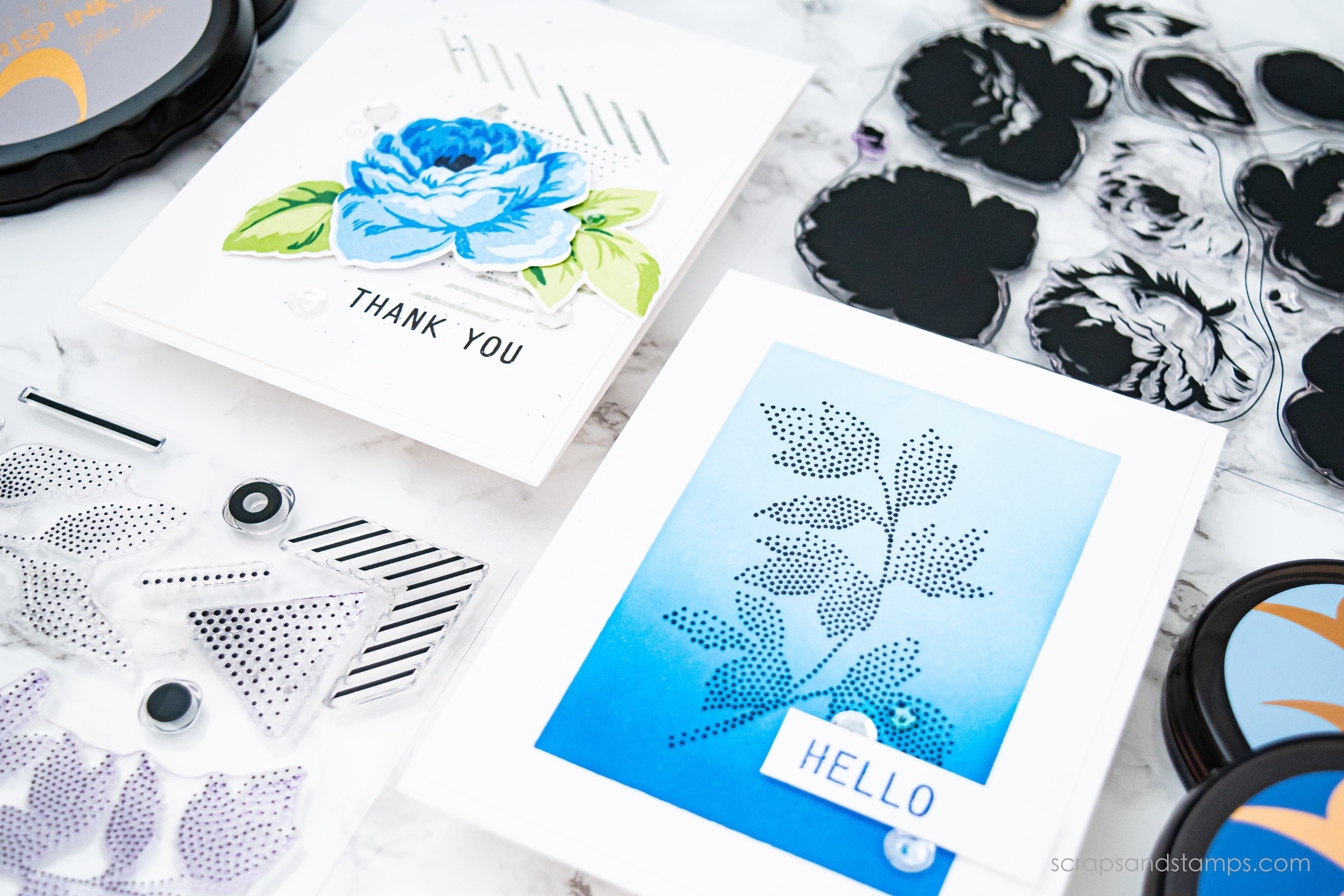
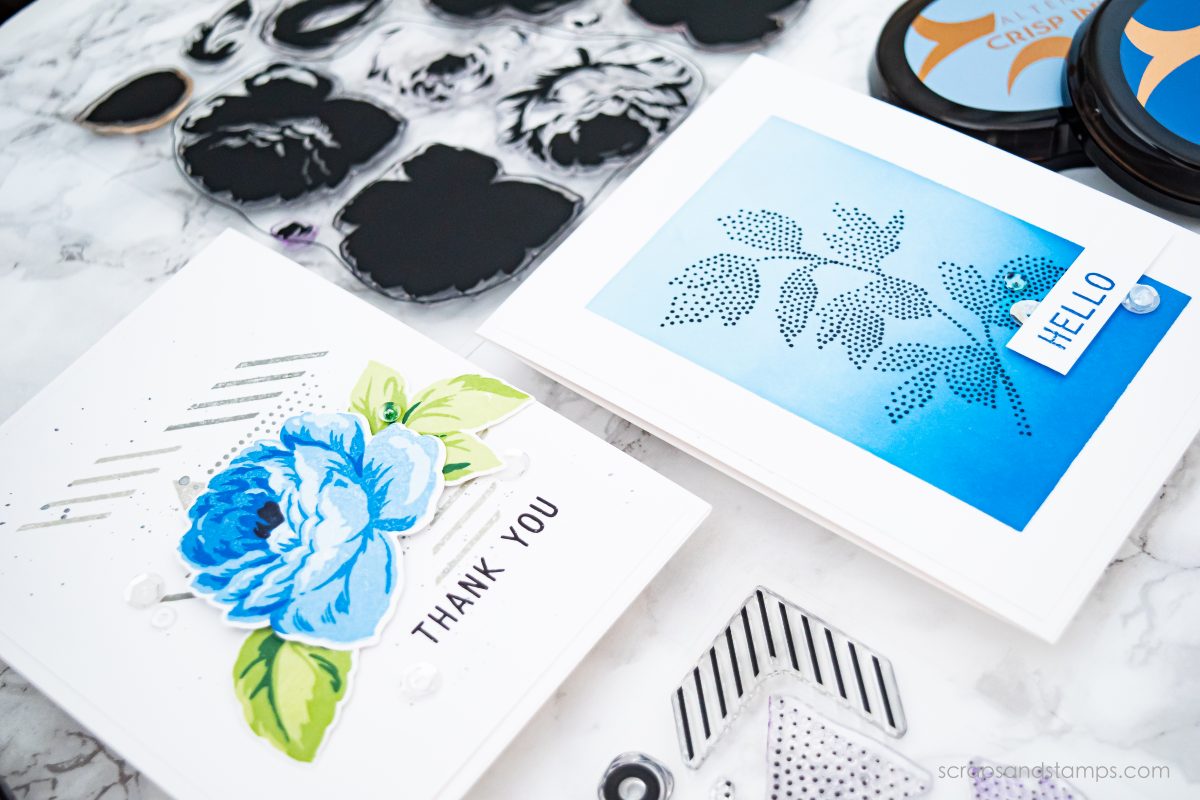
One of the things that can help you with making your stamped images stand out is to play with color contrast. In today’s projects, I used gray/blue/green in one card to help each element stand out while not overwhelming each other. In another card, I simply play with different shades of blue and black to create an eye-catching focal point.

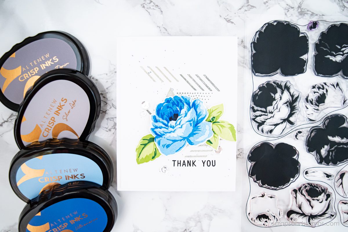
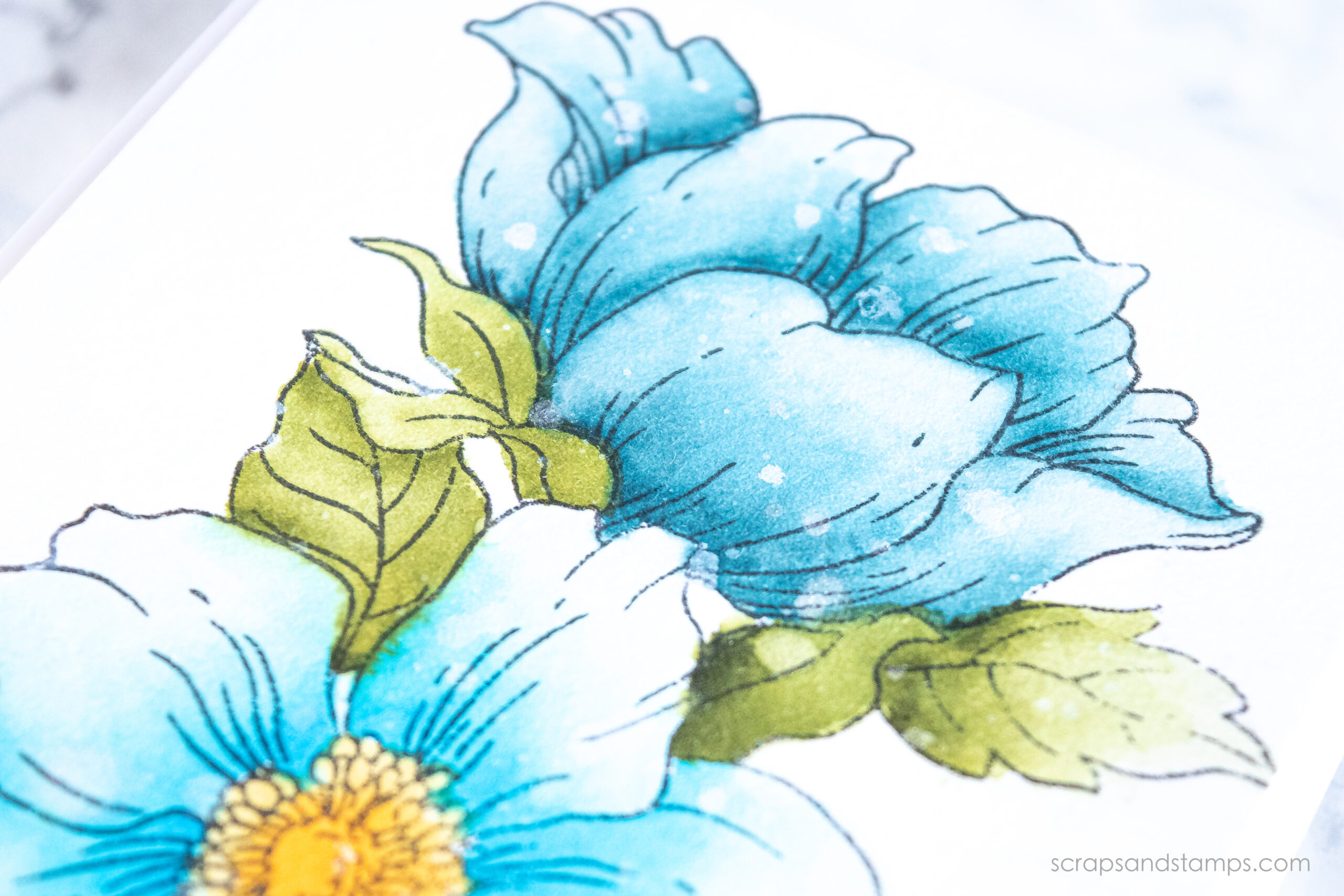
The first card is created with the Antique Roses stamp set and its coordinating die set, and fun patterns from the Dot Art stamp set. This is the card I played with three different color families to pop out the focal point.

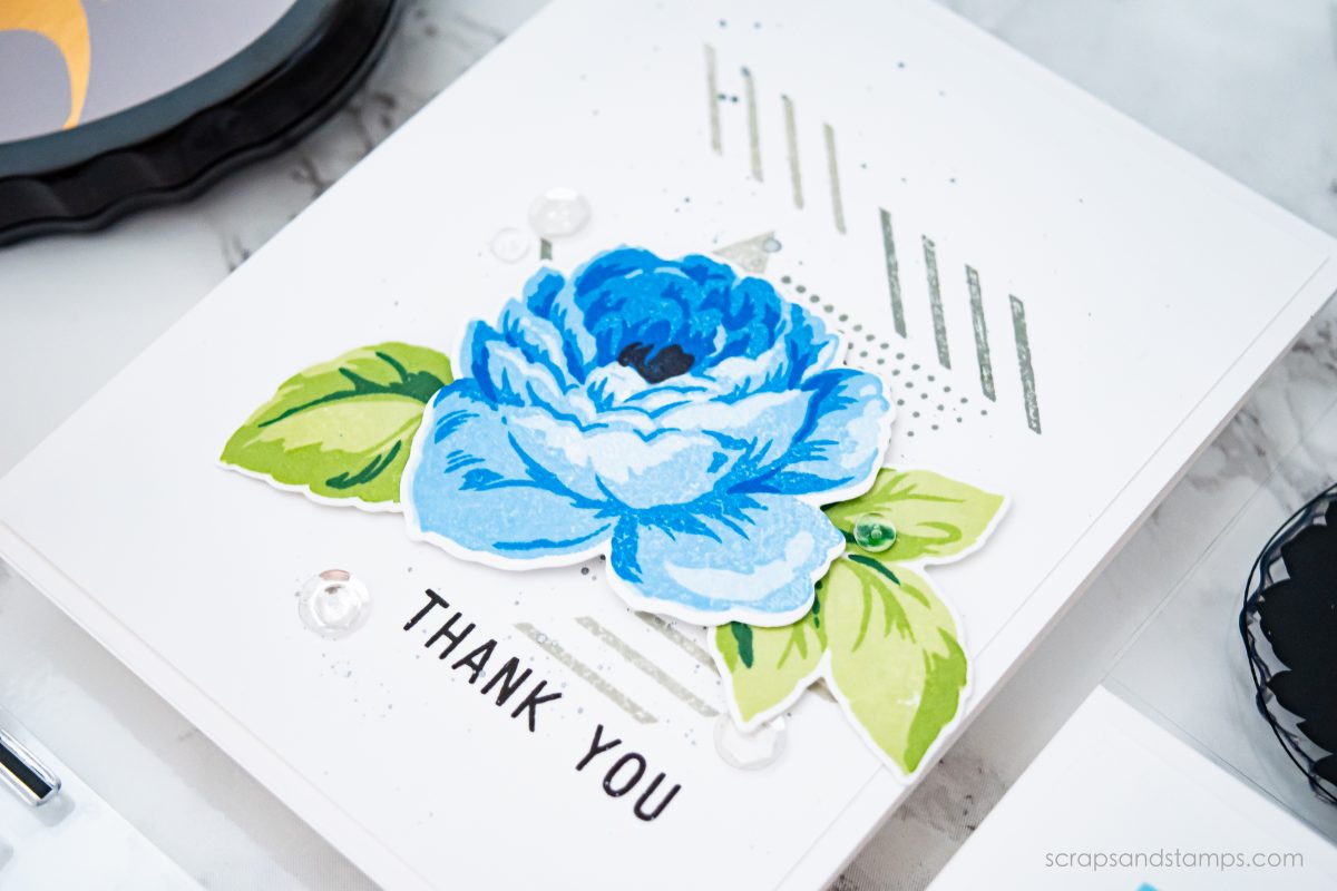
I stamped the rose image in blue color layers and the leaves in green layers. To help this cut out stamped image stand out more, I added patterns in two different shades of gray. While it creates a subtle background, it also adds a nice depth to it.

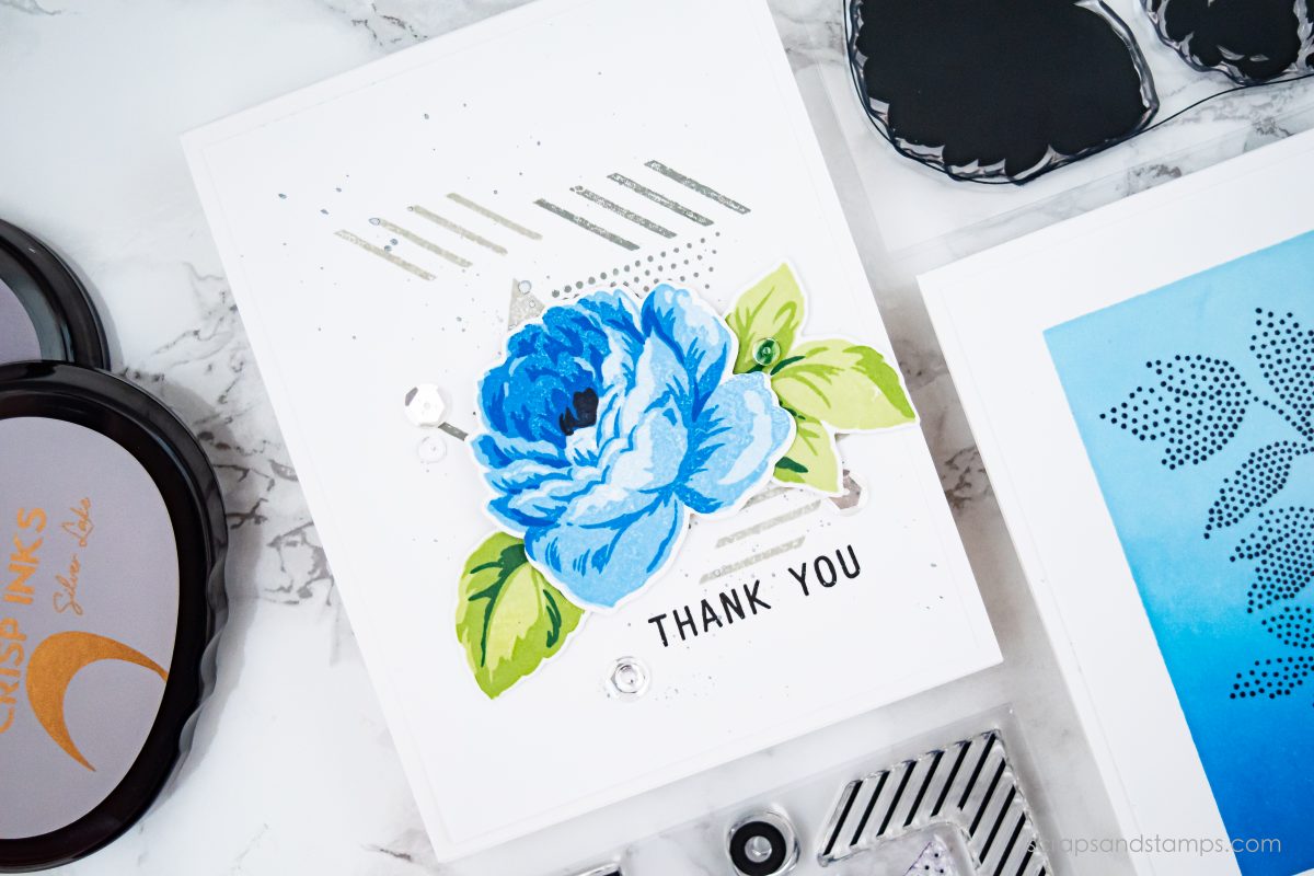
I also added some splashes using the Metallic Silver color from the Winter Wonderland Watercolor Brush Marker Set. Just a tiny bit of splatters add more interest to the card.

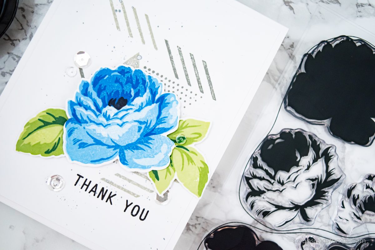
Finishing touches were added with some clear sequins and clear drops.

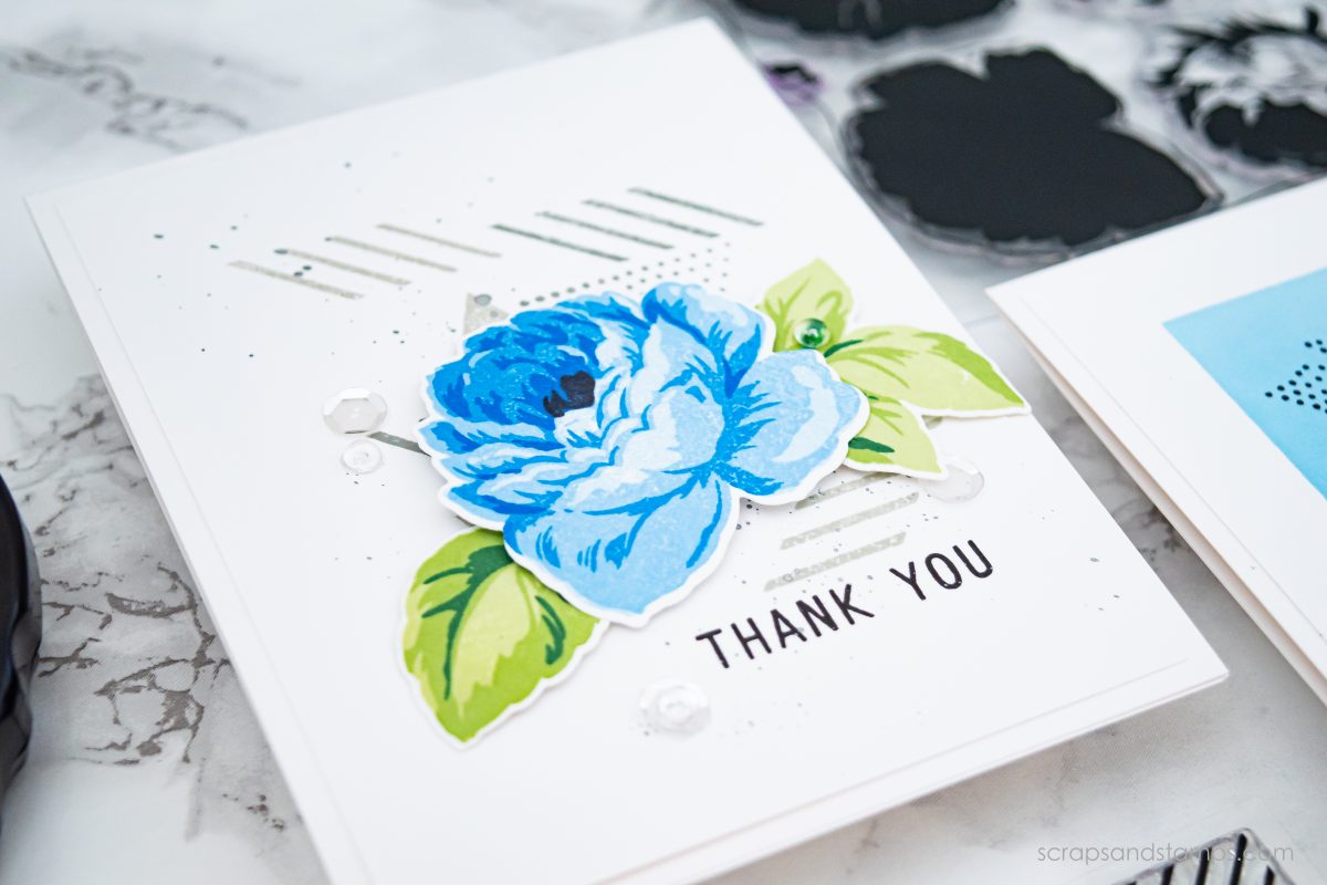
I am really in love with the Antique Rose stamp set – don’t you agree? The detailed layers just make the stamp image look so alive!

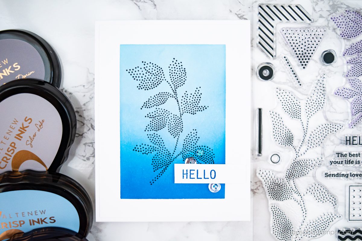
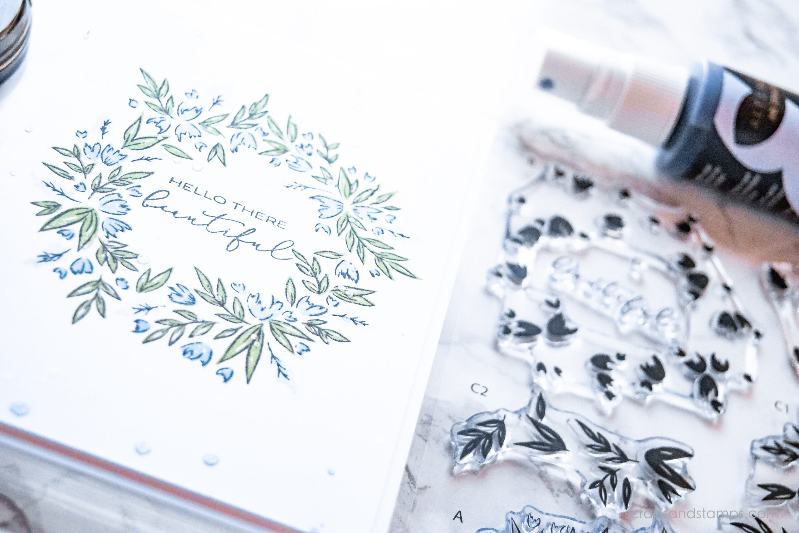
Next project is created using the same blue color shades but in a different way. Instead of stamping, I did ink blending with these fun blue shades.

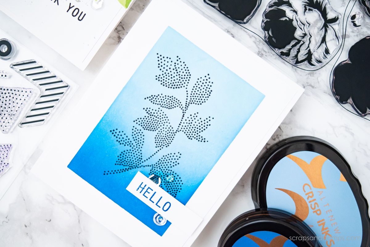
Ink blending can be used in many different ways, but I love creating a focal point window for the main image. It sets the tone in such an elegant way in my opinion.

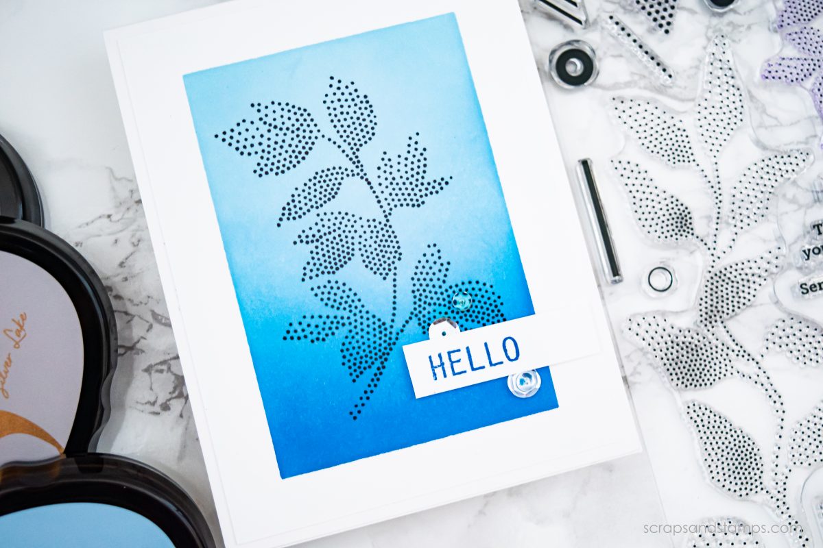
After the ink blending portion, I stamped one of the floral images from the Dot Art set in black to pop it out.

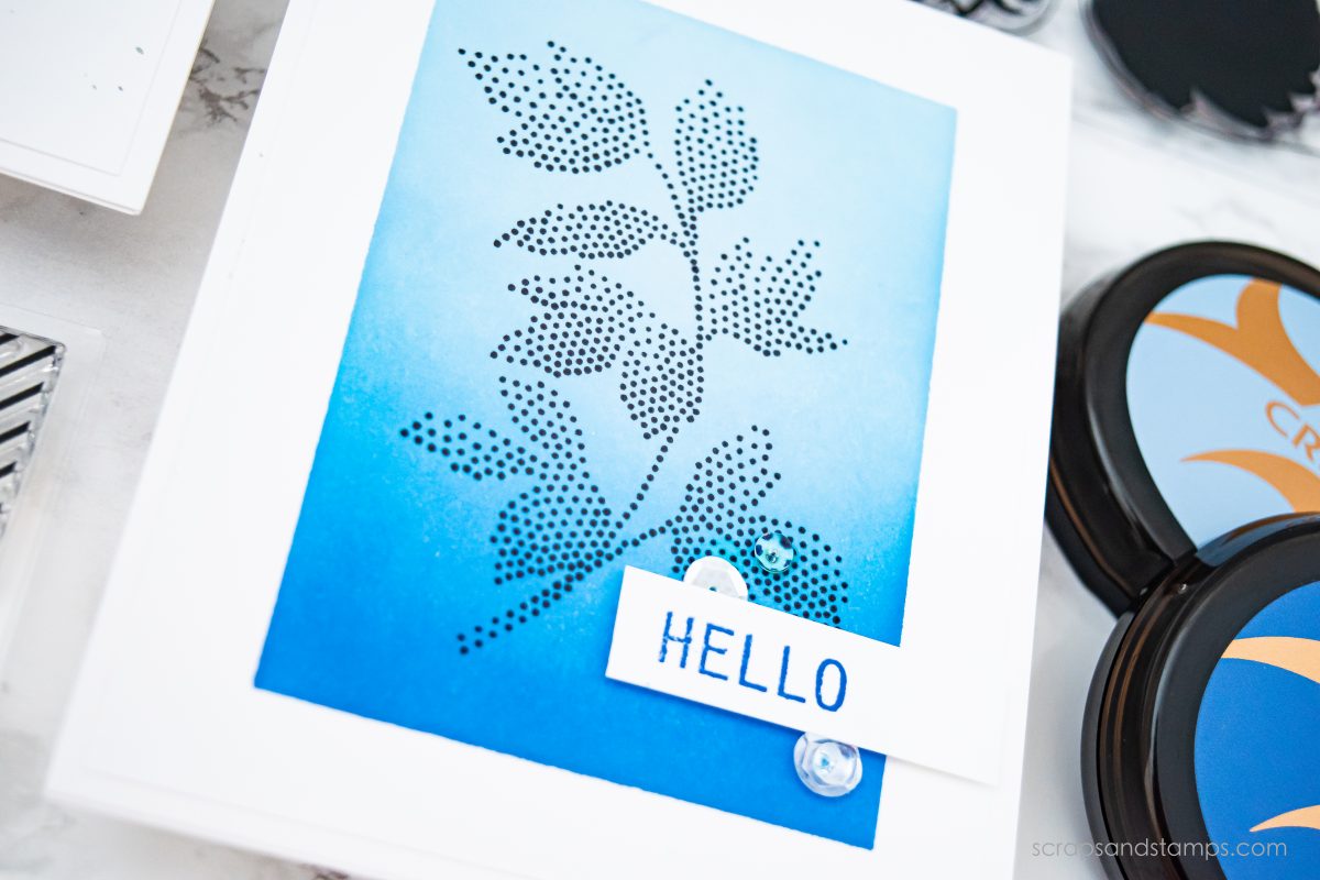
You can create a simple one layer image without adding another “physical layer” to the card when playing with color contrast concept. This will help your main image to stand out effortlessly without making the card bulky.

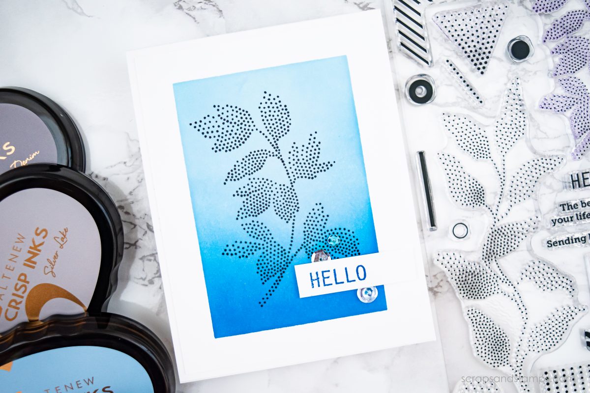
The sentiment was stamped in dark blue from the same stamp set. I kept it very clean and white to allow the focal point to receive all the attention when looking at the card.

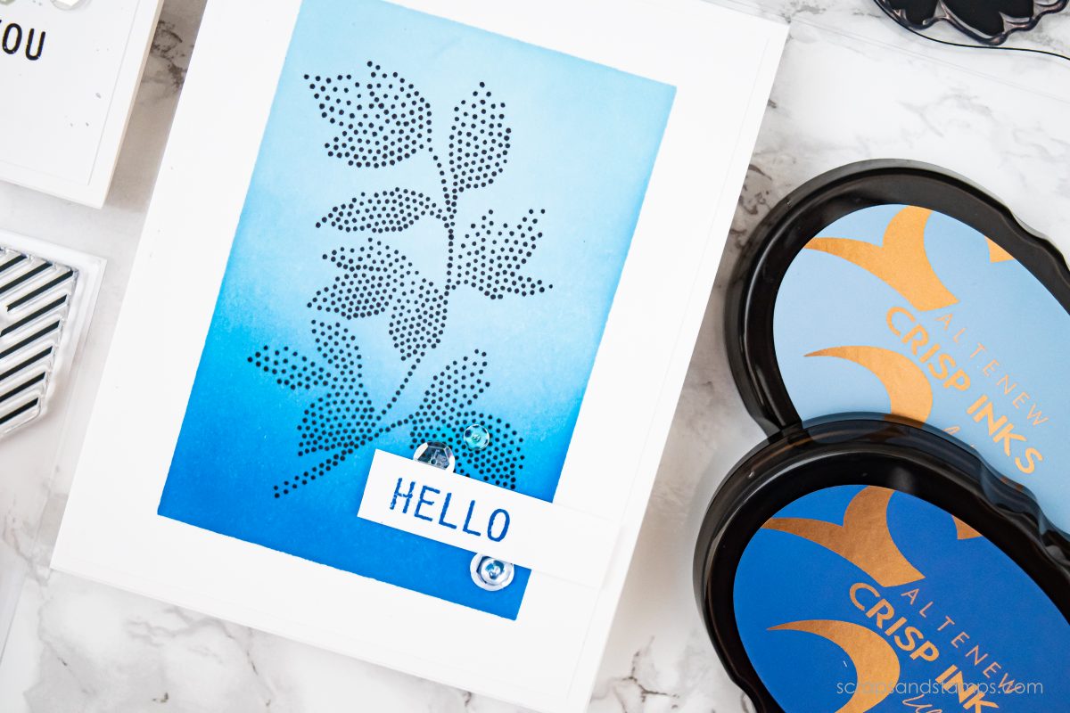
Same finishing touches from the first card were added here as well.

There you go! You can easily create two completely different looking cards using the same stamps and inks.

SHARE YOUR PICKS

Which one is your favorite card from the two? Also, what is your most favorite stamp set from today’s release? Comment below for me, I would LOVE to hear your picks!!


SUPPLIES

See below for all the products used in today’s project. Click ATN for Altenew, EH for Ellen Hutson, SSS for Simon Says Stamp, or AMZ for Amazon. I participate in several affiliate programs where I get a small commission at no additional cost to you when products are purchased through links I share here. Thank you for your support!


GIVEAWAYS

There are TWO giveaways you can enjoy!

  1. Altenew is giving away SIX $50 gift certificates to Altenew store! Make sure to visit their blog and leave a comment to win.
  2. My blog readers get another chance to win a $20 gift certification to Altenew store! Please leave me a comment below by August 16th, 11:59pm PST. All winners will be announced on the Altenew blogs on 08/17/2019 Good luck!!

BLOG HOP

I am participating in a fun blog hop to celebrate today’s release! Next stop on the hop is Janette Kausen! Make sure to stop by and leave some love for her! Please see below for the full blog hop list.

  • Altenew Card Blog
  • Laura Bassen
  • Norine Borys
  • Jaycee Gaspar
  • Therese Calvird
  • Nathalie DeSousa
  • Nicole Picadura
  • Janette Kausen
  • Sveta Fotinia
  • Kelly Griglione
  • Enza Gudor
  • Erum Tasneem
  • Sandra Dietrich
  • Laurie Willison
  • Virginia Lu
  • Reiko Tsuchida
  • Jennifer McGuire
  • Altenew Scrapbook Blog
  • Emily Midgett
  • Lydia Fiedler
  • Jen Schow
  • Svitlana Shayevich
  • Amber Rain Davis
  • Maryam Perez
  • Agnieszka Malyszek
  • Zinia Redo
  • Caly Person
  • Kymona Tracey
  • Alex Syberia
  • Nenette S. Madero
  • Laura Volpes
  • Lilith Eeckels
  • Terri Marie Koszler
  • Kelly Latevola

INK BLENDINGSTAMP LAYERINGVIDEO
Share

ALTENEW  / INK BLENDING  / STAMP LAYERING  / VIDEO TUTORIAL

Nicole
Cardmaker, stamper, watercolor enthusiast, and planner lover

You might also like

Stamping Tutorial – Step-by-step Stamp Layering (VIDEO+GIVEAWAY)
May 12, 2020
Simple & Easy Watercoloring on Stamped Images (VIDEO+GIVEAWAY)
April 17, 2020
Creating Watercolor Swatch + Gradient Watercoloring (VIDEO & GIVEAWAY)
April 2, 2020

93 Comments


Karthikha Uday
August 8, 2019 at 6:21 am
Reply

I am a fan of blue and I lovvvve your cards!! They are gorgeous!! <3


Dee Earnshaw
August 8, 2019 at 6:53 am
Reply

love these cards – they are so different and inspiring – LOVE the second card – thanks for sharing


Raji Rao
August 8, 2019 at 7:03 am
Reply

Love the rose card if I have to pick


August 2019 Stamp/Die/Mask Stencil Release Blog Hop + Giveaway - Altenew Blog
August 8, 2019 at 7:05 am
Reply

[…] Nicole Picadura […]


gail yanek
August 8, 2019 at 7:06 am
Reply

DOTS rule – ie, that card wins.


Debbie Rumpza
August 8, 2019 at 7:10 am
Reply

Gorgeous blue rose card!


Delia Wilkes
August 8, 2019 at 7:10 am
Reply

Love both cards, but my favourite is the Dot Art stamp card. Just love the simple elegance.


August 2019 Stamp/Die/Mask Stencil Release Blog Hop + Giveaway - Altenew Scrapbook
August 8, 2019 at 7:20 am
Reply

[…] Nicole Picadura […]


Jen F
August 8, 2019 at 7:56 am
Reply

You did a great job showing the color contrast!!


Sweet Sarah
August 8, 2019 at 8:43 am
Reply

Really enjoyed watching your video and plan to get the Dot Art set of stamps.


Patonslake
August 8, 2019 at 8:43 am
Reply

Blue is my favorite color and I love roses. Your colors and composition on the cards are just so lovely.


barbara lassiter
August 8, 2019 at 8:45 am
Reply

Both cards are lovely and would be simple to create if you needed a card fast (as I often do)! It’s a close call, but the antique rose card is my favorite!


Mirella Rogan
August 8, 2019 at 8:55 am
Reply

So beautiful, both of these, I love the blues!


Margie
August 8, 2019 at 8:57 am
Reply

Love the subtle background you added on the rose card – that isn’t something i would have thought to do, but it completes the card perfectly!


Dana W
August 8, 2019 at 8:57 am
Reply

Gorgeous cards! The blues really pop!!


Anne Kunde
August 8, 2019 at 9:10 am
Reply

Love the soft blue hues and the dot stamps are so fresh and cute.


Margie King
August 8, 2019 at 9:22 am
Reply

Thank you for sharing and doing a video. I bought the ventage roses a few months ago and still figuring how to layer but might have to get this rose.


Fonda Rush
August 8, 2019 at 9:32 am
Reply

Nice cards! I love blue!


Michele W
August 8, 2019 at 9:41 am
Reply

I fell in love with the new rose stamp set as soon as I saw it but wasn’t sure I liked the dot art set; however, the more I see it in use the more I think I need to give it a second look. Your beautiful cards are helping to win me over. Thanks for sharing!


Rema DeLeeuw
August 8, 2019 at 10:31 am
Reply

These cards are all amazing! Love this release!


Lesley S.
August 8, 2019 at 10:32 am
Reply

Simple and useful explanation of how to create interest with contrasting colours. The floral image from the Dot Art set is very eye-catching!


SD Pooja
August 8, 2019 at 10:37 am
Reply

Two beautiful cards in blue ! I loved the blue ,green and grey on vintage rose card a lot ! Thanks for sharing the trick to create OLC by masking with second one 🙂


viera
August 8, 2019 at 10:41 am
Reply

My favourite rose stamp in my favourite colour blue! so beautiful


Andrea
August 8, 2019 at 11:46 am
Reply

Your cards are absolutely lovely, great work with this beautiful stamp set


Nana Griffin
August 8, 2019 at 12:26 pm
Reply

So very pretty, of course I love the blue.


Julie Haedtke
August 8, 2019 at 12:42 pm
Reply

OH so Bluetiful! Ha Ha! My favorites are the Polish (because I am) and the dots. GREAT release:-)


Karen L K
August 8, 2019 at 12:47 pm
Reply

Very nice cards. First I love the blues. The rose card is my favorite. I like that you used geometric things on the background. I really like the plumeria and the layered pansy die set from this release.


Nelya
August 8, 2019 at 1:20 pm
Reply

That blue rose is just gorgeous, and the dot art stamp is such a neat idea! I wonder if you could use it for paper piercing.


Jeanne Ragan
August 8, 2019 at 1:43 pm
Reply

Beautiful Blue cards! I like the Antique Roses stamp set, but I was surprised by how stunning your card was using the Dot Art set. Really neat!


Meghan Kennihan
August 8, 2019 at 2:56 pm
Reply

I LOVE LOVE LOVE the blues! The background and that beautiful rose!


Andre M.
August 8, 2019 at 4:48 pm
Reply

Florals are always so lovely in blue, your second card is my fave. Thanks for sharing your tips and the technique video


Jeanne Beam
August 8, 2019 at 5:51 pm
Reply

Such gorgeous cards! Love the colors….
Thanks for sharing.


Sherri Little
August 8, 2019 at 5:55 pm
Reply

Very pretty blues.


Tammy L Davis
August 8, 2019 at 6:03 pm
Reply

Beautiful cards! That Dot Art Stamp is my favorite!


Liz O.
August 8, 2019 at 6:18 pm
Reply

Fabulous CAS designs Nicole! Love the Antique Roses set, you did an outstanding job showcasing it. Thanks for the inspiration!


Mendy Crumpton
August 8, 2019 at 7:24 pm
Reply

Great release and awesome inspiring projects.


Janis Ford
August 8, 2019 at 7:48 pm
Reply

I love all things blue so it’s hard to pick a favorite!


Kristen
August 8, 2019 at 8:35 pm
Reply

You always come up with the most beautiful color combinations, and you did it again! The Antique Roses are so elegant and your blue card creations are just gorgeous, so excited to see these new stamp sets “in action”!


Kristine Boydstun
August 8, 2019 at 9:09 pm
Reply

Gorgeous cards!


Nanette Leiker
August 8, 2019 at 9:31 pm
Reply

Both of your cards were great, but I think the “Dot art” set edged the other one out. Thank you for sharing your techniques with us!


Donna
August 9, 2019 at 4:24 am
Reply

I love the dot art set card most. The ombre blend is a great backdrop for the great dot leaf image. I really love that leaf image.


Jane Booth
August 9, 2019 at 4:59 am
Reply

You chose my 2 favorite sets from this release! love seeing all of the wonderful inspiration!!!


Patty Eifert
August 9, 2019 at 6:12 am
Reply

These are beautiful cards! I love those shades of blue!!


Bonnie Eng
August 9, 2019 at 7:58 am
Reply

Those colours are fabulous – I love those blues. I especially love that gorgeous dotted art card!


Dianne Bailey
August 9, 2019 at 11:04 am
Reply

The colour blue is so relaxing, blending the shades gives me a perfect ski appeal in your Dot art card, blue for the Antique Rose is beautiful


Nandini Karmarkar
August 9, 2019 at 11:08 am
Reply

Gorgeous card. Love the blue and green combo. I also love the background on the first card.


Amy Williams
August 9, 2019 at 11:20 am
Reply

I don’t tend to gravitate towards blue too often…but these are gorgeous! Maybe I’ll have to use some blue!


Donna Gourley
August 9, 2019 at 11:42 am
Reply

I love your card using the Antique Roses set!


Geri S
August 9, 2019 at 12:18 pm
Reply

Agreed – Antique Roses is terrific! And your cards are beautiful with a wonderful lesson on contrast. Thanks!


Laurie Black
August 9, 2019 at 1:47 pm
Reply

Pretty cards, the layered rose is my favorite


Marisela Delgado
August 9, 2019 at 2:05 pm
Reply

Such great cards


Jan G.
August 9, 2019 at 2:53 pm
Reply

The color on both these cards are so beautiful! Thank you for sharing!


joy meadows
August 9, 2019 at 3:21 pm
Reply

Blue is my favorite color and your cards are simply gorgeous!


An'Jenic Gibson
August 9, 2019 at 5:45 pm
Reply

Two beautiful cards. I really love the fun dot art stamp.


Susan P
August 9, 2019 at 8:10 pm
Reply

Love your cards! Thanks for sharing the video!


Teri S.
August 10, 2019 at 7:02 am
Reply

Both your cards are wonderful & I really like the look of the geometric shapes stamped in the grey ink behind that beautiful layered rose.


Louanne Collins
August 10, 2019 at 8:47 am
Reply

So love that Dot Art Stamp – great cards!


Ruth Gibbs
August 10, 2019 at 8:52 am
Reply

Great release! The Dot Art stamp is so unique and beautiful!


Sue D
August 10, 2019 at 9:39 am
Reply

Pretty cards in blue. My fave is the rose.


Linda Walter
August 10, 2019 at 3:02 pm
Reply

Nicole,
I’m with you about loving the antique roses stamp set and dies. I really like your card using that set. I also feel like I need to get the blue inks you used, they look so beautiful!! Can’t wait for my antique rose stamp and die set to arrive, I ordered them as soon as I saw them.


Jenrescuemama
August 10, 2019 at 5:37 pm
Reply

I can’t decide which I like best. They are both lovely!


Lisascreativeniche
August 10, 2019 at 7:42 pm
Reply

So very pretty, but I really love the dotted leaf image… It just pops!


JanLM
August 10, 2019 at 8:31 pm
Reply

I love your designs, so pretty! I love the ease of use of both stamp sets, and am falling in love with the dotted stamp set.


Denise Bryant
August 10, 2019 at 10:12 pm
Reply

Such beautiful samples! Love your cards!


Linnea Sundstrom
August 11, 2019 at 10:07 am
Reply

LUV those blues!!!


Cyndi Morris
August 11, 2019 at 12:45 pm
Reply

Wonderful cards. The Antique Roses set is one of my absolutely favorites from this fantastic release, and that card is gorgeous.


3kidmama
August 11, 2019 at 1:29 pm
Reply

I these cards – but of course these shades of blue are my very favorite colors! Its so awesome seeing that dot art set put to use in the blog hop today. It looks fantastic, yet until seeing all the inspiration from the Altenew artists on the hop – I would have had no idea the huge variety of styles that set would enhance! Great job!


Connie
August 11, 2019 at 2:45 pm
Reply

Hi Nicole 🙂 Both of your cards are terrific!!! Interesting that you chose the ANTIQUE rose and the stamp that reminds me of pointillism! Thanks for the inspiration 🙂


Kathy P
August 11, 2019 at 4:03 pm
Reply

Love your ‘simple’ cards, Nicole! Beautiful designs and colors, and these are two of my fave stamp sets from this release! Your videos are so clear and descriptive, and I find them very helpful! Thanks for sharing!


Cherri Simon
August 11, 2019 at 4:49 pm
Reply

Very nice. love the antique rose stamp – really pretty in blue!


Jenny N
August 12, 2019 at 1:14 am
Reply

Enjoyed your process video, beautiful cards!


Lana Branham
August 12, 2019 at 6:05 am
Reply

Your blending is so beautiful!


Denise Kitts-Wadlow
August 12, 2019 at 7:02 am
Reply

Nicole, your projects are simply gorgeous! I love both of the stamp sets you used, and I’m in blue heaven over the color palettes you chose!!! TFS


Lauryne Cunningham
August 12, 2019 at 11:11 am
Reply

Beautiful cards! I love how you used the Dot Art stamp set leaf image- so pretty!


Zlatka Kabaivanova
August 12, 2019 at 5:24 pm
Reply

Your cards are so beautiful! I especially love the second one – so simple and elegant!


jenny stratton
August 12, 2019 at 6:05 pm
Reply

I love the the flowers and the dotted leaves cards.


Stacey Kowbel
August 12, 2019 at 6:10 pm
Reply

Gorgeous cards! I love the colour and such great designs!


Toni Harris
August 12, 2019 at 7:00 pm
Reply

Your cards are beautiful.I usually have difficulty with the layering stamps but this looks pretty simple.


Kelsey Thomas
August 12, 2019 at 7:05 pm
Reply

These are so pretty!


    Annette Reed
    August 13, 2019 at 2:02 pm
    Reply

    Your cards are beautiful. I am really liking these new sets.

Carol Koniecki
August 12, 2019 at 7:47 pm
Reply

This is wonderful ink blending! It really makes the Dot Art stamps shine. Thank you.


Gladys
August 14, 2019 at 8:13 am
Reply

Beautiful blues… I love the blues! You make them look fabulous – they come alive on paper! Thanks for sharing!


Daria Zender
August 14, 2019 at 8:17 am
Reply

Beautiful cards, Nicole! I really love the Dot Art Stamp set and you showcased it beautifully!!


Cyndi Morris
August 14, 2019 at 8:49 am
Reply

Beautiful cards. I love the gorgeous blues.


Rose Mary Smalley
August 14, 2019 at 11:21 am
Reply

Nicole, the Antique Roses set is my favorite…maybe it is because my name is Rose…I seem to go towards them every time I see stamp sets that are of Roses. Your cards are both quite lovely. Great video. Thank you.


Rozy
August 14, 2019 at 12:18 pm
Reply

Love all the blues and your cards are wonderful. Great video, too!


Louise Charlton
August 14, 2019 at 12:26 pm
Reply

Love your cards, especially the blue rose card!


Gretchen Wilson
August 14, 2019 at 1:44 pm
Reply

Absolutely gorgeous cards, love the dotted foliage set! Great video too!


tina z. treebug
August 14, 2019 at 4:02 pm
Reply

wow, so beautiful, I love blue!


Tracey Landt
August 14, 2019 at 5:32 pm
Reply

Beautiful cards Nichole. Thank you so much for sharing.
T x


Beverly Jordan
August 14, 2019 at 9:50 pm
Reply

Beautiful designs and love the ethereal blues to match up with them!


Gab
August 15, 2019 at 1:18 am
Reply

Oh wow, these are so pretty


August 2019 Stamp/Die/Mask Stencil Release Giveaway Winners - Altenew Blog
August 17, 2019 at 2:01 pm
Reply

[…] Nicole Picadura […]


Leave a Reply Cancel reply

Your email address will not be published. Required fields are marked *

  • Meet Nicole

    Cardmaker. Planner. Watercolor Enthusiast

  • Connect w/ Nicole

  • Instagram

    58-60/60 Today’s Color(s) - Pearlescent White, Industrial Antique Silver, Iridescent Gold

Last swatches of my custom palettes featuring Daniel Smith Watercolors 💕 These last three metallic watercolors were little tricky to show on the usual flower swatches so I opted to the square swatch cards. Pearlescent white is a lovely white shimmery color, ill be sharing a project painted on a black paper in the near future. Silver and Gold are metallic staples so I wanted to make sure to include at least one of each. Ill be sharing how these look overlapped with other solid colors on different projects!

Thank you for following me on this watercolor swatch journey so far! I surely hope you enjoyed seeing all the colors and hope these inspired you in a creative way! Thank you for all your likes and comments! 🥰🥰🥰

#nicolescards #scrapsandstamps #danielsmithwatercolors #danielsmithwatercolor #danielsmithartistsmaterials #escodabrushes #watercolor #watercolorswatches #floralwatercolor #watercolorswatching #colorswatching
    57/60 Today’s Color - Kyanite Genuine

Today is the last day of sharing fully colored swatches, and this lovely grey color is the finishing color of the swatch collection. Tomorrow ill be sharing three metallic colors with mini swatches so the colors are shown better. This shade is a pretty cool toned grey that ive come to enjoy a lot when working with it. It has a subtle shimmer just like other #danielsmithprimatek colors. It also creates wonderful monochromatic look 🖤

#nicolescards #scrapsandstamps #danielsmithwatercolors #danielsmithwatercolor #danielsmithartistsmaterials #escodabrushes #watercolor #watercolorswatches #floralwatercolor #watercolorswatching #colorswatching
    56/50 Today’s Color - Burnt Bronzite Genuine

This lovely neutral brown comes with soft, amazing shimmers and is a part of #danielsmithprimatek collection. The granulation adds even more texture to this earthy color, allowing you to get more interests when coloring/painting! 

#nicolescards #scrapsandstamps #danielsmithwatercolors #danielsmithwatercolor #danielsmithartistsmaterials #escodabrushes #watercolor #watercolorswatches #floralwatercolor #watercolorswatching #colorswatching
    55/60 Today’s Color - Iridescent Electric Blue

I had to include a blue to my palette from #danielsmithluminescentwatercolors collection and I have to say, this has to be one of my fav of all. Look at the vivid color with tiny, full shimmers 😍😍

#nicolescards #scrapsandstamps #danielsmithwatercolors #danielsmithwatercolor #danielsmithartistsmaterials #escodabrushes #watercolor #watercolorswatches #floralwatercolor #watercolorswatching #colorswatching
    54/60 Today’s Color - Duochrome Blue Pearl

Sparkle overload!!! I was so happy to be able to capture these lovelies in the photos. Look at these shimmers, aren’t they just so amazing? 😍 It is another lovely color from #danielsmithluminescentwatercolors collection. It is oh-so-pretty!

#nicolescards #scrapsandstamps #danielsmithwatercolors #danielsmithwatercolor #danielsmithartistsmaterials #escodabrushes #watercolor #watercolorswatches #floralwatercolor #watercolorswatching #colorswatching
    53/60 Today’s Color - Iridescent Ruby

Another choice of mine from #danielsmithluminescentwatercolors 😍 This hue has a lovely reflection of ruby color with lots of tiny shimmers. Its granulation adds a lot to the texture as well.

#nicolescards #scrapsandstamps #danielsmithwatercolors #danielsmithwatercolor #danielsmithartistsmaterials #escodabrushes #watercolor #watercolorswatches #floralwatercolor #watercolorswatching #colorswatching
    52/60 Today’s Color - Duochrome Violet Pearl

This beauty is a part of #danielsmithluminescentwatercolors family, showing off a lovely lavender with a silver tone. There is so much shimmer going on, you’ll love it!! I cannot wait to try these on a black watercolor paper especially.

#nicolescards #scrapsandstamps #danielsmithwatercolors #danielsmithwatercolor #danielsmithartistsmaterials #escodabrushes #watercolor #watercolorswatches #floralwatercolor #watercolorswatching #colorswatching
    51/60 Today’s Color - Amethyst Genuine 

Im excited to share the first #danielsmithprimatek color from my palette! Primatick colors have a lovely subtle shimmers came from the stones the pigments are made of. They are subtle but adds a nice touch! This lovely cool gray purple pigment has pretty shimmers throughout, tho it is hard to catch it on camera. If you see tiny dots in the 2nd pictures, those are the shimmers im referring to! Oh so lovely 💕

#nicolescards #scrapsandstamps #danielsmithwatercolors #danielsmithwatercolor #danielsmithartistsmaterials #escodabrushes #watercolor #watercolorswatches #floralwatercolor #watercolorswatching #colorswatching
    50/60 Today’s Color - Lamp Black

Meet the lovely black pigment, that provides wonderful intensity and smooth finish. This color is the end of the regular pigments I selected for my custom palette. Starting tomorrow, ill be sharing some amazing PrimaTek colors as well as Iridescent colors!

 #nicolescards #scrapsandstamps #danielsmithwatercolors #danielsmithwatercolor #danielsmithartistsmaterials #escodabrushes #watercolor #watercolorswatches #floralwatercolor #watercolorswatching #colorswatching
  • Favorite Stores


  • Topics

    ALCOHOL INKS ALCOHOL MARKERS BASICS CHRISTMAS COLORED PENCILS DIE CUTTING DISTRESS INKS INK BLENDING ORGANIZATION PASTEL PENCILS PRODUCT REVIEW STAMP LAYERING VIDEO WATERCOLOR
  • DISCLOSURES

    • DISCLOSURE
    • PRIVACY POLICY


@nicolescards

© 2020 Nicole Picadura. All Rights Reserved.